
The Established Logo
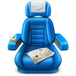
Since 2012, Passenger has been sporting a lush, blue airplane seat as its logo (made by the awesome folks at Softfacade). With this chair we wanted to emphasise Passenger's ease of use and basically say; Take a seat and we'll do the rest. Although the product is still easy to use, it has evolved in such a way that there's a lot more aspects to highlight in the branding. Needless to say, this once familiar and comfortable chair is starting to feel a bit worn out.
Trying Something Different
Timing couldn't have been more perfect. Nick, the newest member of the Phusion team and our full-time designer started rebranding the entire Passenger product from the ground up. Beginning with the logo.
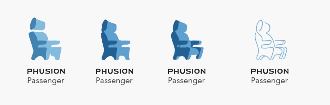
At first we tried a re-imagined version of the chair to see if it could work as something fresh and minimal. But it just never stopped being a boring static chair. We knew that if we kept the chair, we would never stand out.
A trip to the zoo
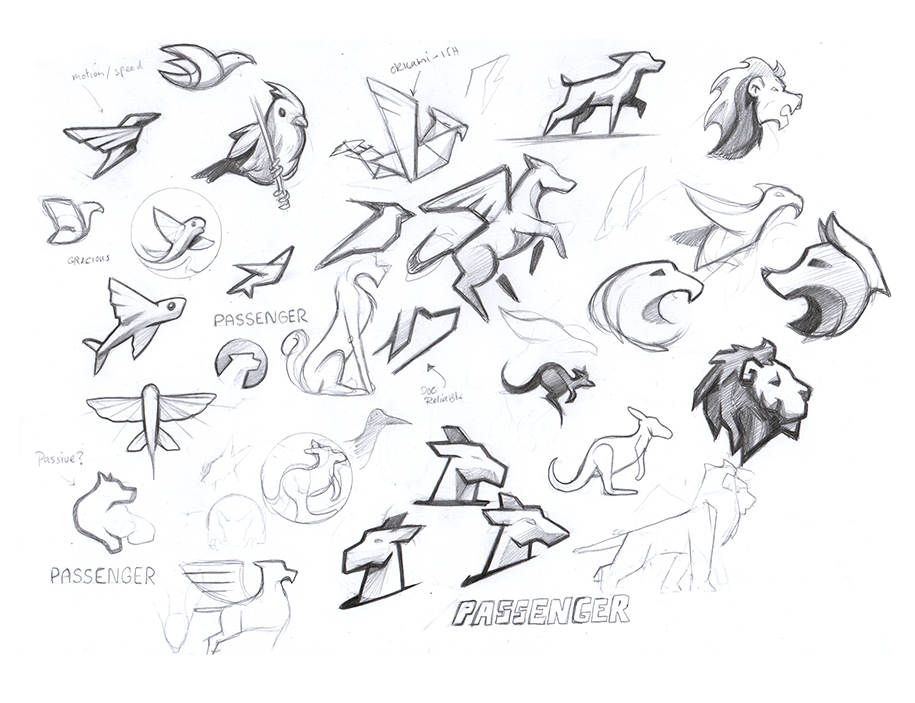
We noticed a lot of companies in our field use animals as their mark (For example docker's whale and Mysql's dolphin) and be likeable, memorable, and symbolic. We decided to try and find an animal that would fit us and went through an entire zoo of different animals that we thought would be a nice symbolic image for our product. While trying to keep in-line with the metaphor we looked to a Joey, a passenger in the pouch of the mother kangaroo. But in the end it never felt right.
Along the way a few stray rocket doodles starter appearing in the sketches. Met with positive remarks, the team decided a space theme for Passenger would be a good direction. That direction was up.
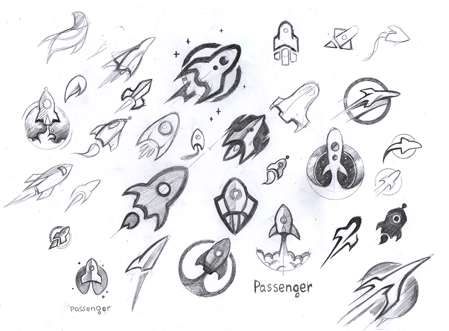
An outer space theme would also accurately envision our company’s goals; to conquer the universe. But we knew the rocket image is used extensively by other companies for many different products. Time to brainstorm again!
Finding the New Logo: Staying safe or going for something unique?
The longer this process took, the more we gravitated towards the idea of just using something cool and unique. Being the total geeks that we are we started thinking about taking notes from anime and shows featuring mech robots. Shout out to Gurren Lagann, Gundam, and Evangelion. A mech also fits well into the 'passenger' metaphor because of their human passengers. Furthermore, mechs are fast, powerful, and flexible; Traits they share with Passenger.
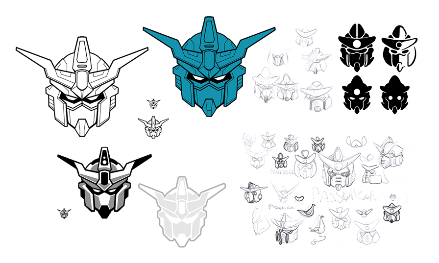
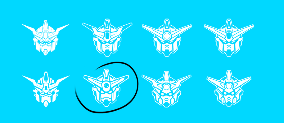
Although the first sketches were kickass, they showed the areas that we needed to work on to turn this from an illustration into a logo. We made it simpler and more human. By rounding the features and making it less menacing we created what would become our final logo sketch.
 Follow on Github