One of the most common issues that Passenger users encounter is a so-called application spawning error, a failure to start their application. This is usually caused by some kind of misconfiguration or problem with the system.
In development mode, Passenger automatically shows a (developer-) "friendly error page" which contains a big dump of troubleshooting information. Though valuable, the amount and structure of the information made it difficult for users to immediately see whether it's a problem with Passenger, their application, their configuration, or maybe even with their system.
Thus we embarked on a quest to redesign the error page!
The old (pre 5.1) page
Not so long ago, the friendly error page still looked like this:
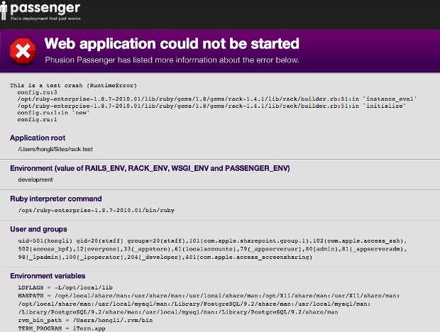
Besides the outdated styling, it was difficult to distinguish important information, and on top of that we were getting contacted by people who thought Phusion was somehow responsible for their favorite site being down when it displayed this Passenger error.
5.1 redesign: who(not)dunnit?
In Passenger 5.1 we cleaned up the design and tried to make it clear to website visitors that there was a problem that the website administrator should look at:
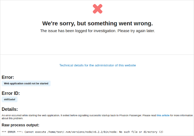
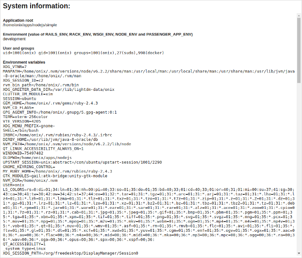
For users of Passenger there was also a slight improvement in that the error and error ID are more prominently visible, but the rest of the information was basically still a big ball of stuff:
5.3 redesign: more info, less overwhelming
The main goal of taking another shot at the error page was to untangle the dump of debug data and provide more structured insight "under the hood", while at the same time becoming less overwhelming.
The best way to avoid real criticism
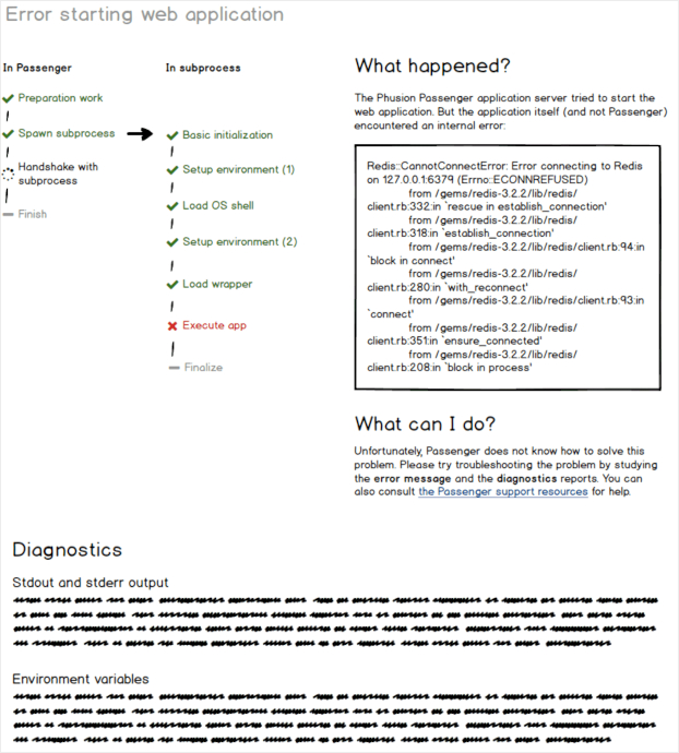
We had some ideas about all of this and wanted to see what users thought. However, criticism can be hard to deal with, so we made a first mockup that helped avoid any real debate:
Time to get serious
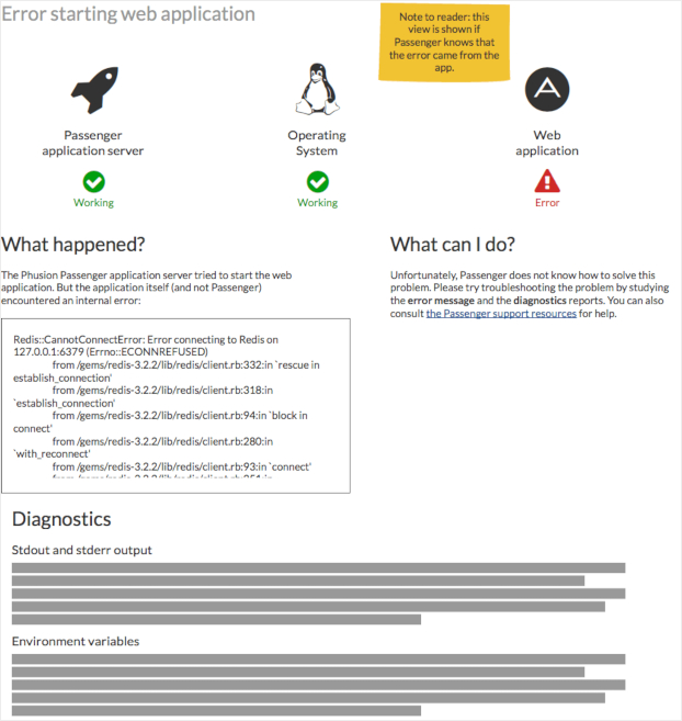
The first mockup appeared to be a success in the sense that users liked the visual representation of the internal processes. From a developer point of view that makes sense. Concerns were raised however that the simplicity of the 5.1 design was lost and non-developers would again be confused. We tried to address this in the next mockup:
Putting it all together
In a way, the simplified design of the second mockup was the worst of both worlds. Too crowded for non-developers, yet lacking the in-depth internal process view for developers. We tried to turn this around by segmenting the information to different tabs. The landing page goes back to being relatively simple:
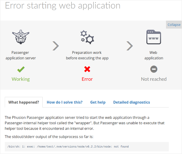
While extensive details can be viewed with a single click:
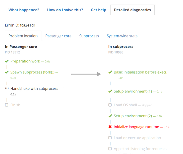
As a bonus, we also added two tabs with any helpful suggestions that Passenger has to offer ("How do I solve this?"), and information about getting support.
This work was introduced in Passenger version 5.3!
Ending credits
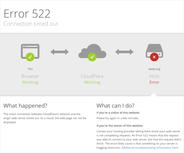
As a final note we'd like to give some credit to the Cloudflare error page as a source of inspiration. Our version still turned out pretty different because Passenger has a lot more information about the server it's running on, and apps that it launches.
cover photo: Hans-Peter Gauster
 Follow on Github